Review: Ivar Revel 32L - $100
Posted by Unknown on Friday, August 01, 2014 with No comments
The good stuff:
This pack has a great concept: shelves for distributing the
weight of your stuff across the full height of the back (suspension
system). It works (sort of). The other thing is that the organizational
pocket is the best of the lot. It is not
only outside of the main part of the pack, but it has no less than 10
slots! Additionally, the pack has a
pocket that is perfectly position and sized for my sunglasses. It is nearly as good as the one on my
Refugio, but it lacks the fleecy goodness.
The Revel also has a nice stiff frame-sheet that keeps the
pack upright and in shape at all times.
The main compartment opens wide and allows easy access to all of your
stuff. It is a quasi-top loader in that
there is no flap or draw cord to cinch it together. You need to zip up before you move on. However, the design does allow you to open it
up away from you when temporarily wearing the pack on your front. The two side mesh pockets hold a full 1L
Nalgene bottle.
The bad stuff:
The Ivar Revel has a similar issue as the Gregory Sketch 28
in that something that the marketing materials claim it has does not exist in
reality. In this case it is missing the
waist strap. It is really odd because
even the marketing photos show a waist strap.
However, as one can see, my Revel clearly does not have a waist
strap. Very odd.
 |
| Note the waist strap in the Ivar photo (from their website) |
 |
| Note the lack of waist strap in my Revel. |
 |
| Just to prove that I actually have the Revel, here is the tag. Note note the name on the UPC sticker. |
Additionally, the design idea is better in theory than it is
in reality. The shelves do allow for
organization, but they do cut down on flexibility. This is exacerbated by the fact that the
laptop section in right in the middle of the main compartment (and for my
purposes is always going to hold a
laptop). This section is also way too thick
for your average laptop. Take a look at the drawing I have made to see why they
had to do it this way.
Perhaps the biggest problem is that the largest section is
at the bottom. That means that you are
still loading your largest items in the bottom of the backpack anyway. I think that Ivar should have designed the
pack to have a separate vertical section for the laptop and left the shelves to
be generic slots for whatever you want. As
of the current design, it feels very much like a conventional pack with the
downside of having less flexibility.
(Some may see the shelves as offering more flexibility, but for my
needs, it offers less.)
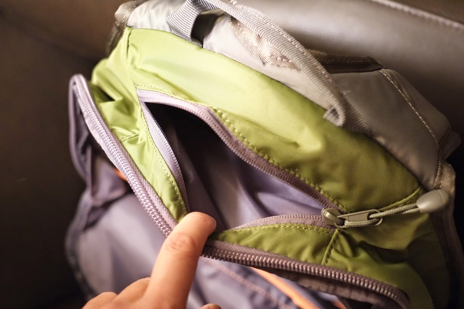
The round plastic zipper pulls look kind of cheap, too. It would have been just as functional to have
a fabric tab like all the other packs.
Ivar has some marketing issues as well. The name simply does not sound
earthy enough to attract the folks who gravitate to companies like Patagonia,
North Face, Black Diamond, etc. In fact,
it has a kind of Slavic sound which, frankly, one does not usually equate with
backpacking in the woods or commuting in the city. I suggest I.O.G. for Ivar
Outdoor Gear. Also, a cooler looking
logo would go a long way towards attracting the customers.
Summary:
This would have been a great pack if it had a single shelf
right in the middle and a separate laptop compartment that one could access
without having to go into the main compartment.
Ivar also needs to bring back the waist strap to this pack. Its elimination absolutely killed it for
me. Not to mention that it is unethical
to state that a product has something when it really does not. I get the sense that this is such a new
company that they are still trying to iron out the wrinkles in everything they
do.
Photos:
 |
| The Ivar Revel. |
 |
| The shelf system. There are two shelves here. The computer slots in between them. |
 |
| Looking down into the middle computer area. Note how thick it is. |
 |
| Here we are looking into the bottom section which has the highest volume of the four sections. (I did say four as you will see in a bit.) |
 |
| This might be a bit hare to discern. It shows the top most section in the main part of the pack. It is about 1/3 the size of the bottom section. |
 |
| Here is the top section (the fourth) that is accessible from its own zipper on the top of the pack. This is where I would keep my sunglasses. |
 |
| Probably the best divided organizer section of all packs reviewed. It is found in a zippered compartment on the front of the pack. |
 |
| Here you can see that there is space below the divided organizer section. |
 |
| This is an open top pocket in which you can stuff your jacket. It is closed by a fastex buckle. |
 |
| Here you can see the zipper for the main compartment. Quality zipper with cheesy plastic tab pulls. |
Categories: Crossover Daypack Review


0 comments:
Post a Comment